

The Strategy Behind Logos
Why Big Brands Succeeded: The Strategy Behind Their Logos
Most people believe big brands succeeded because they had great logos. In reality, it’s the opposite. Their logos became powerful because of the strategy behind them, not because they perfectly explained what the business does.
And that’s where most small businesses get it wrong. At Briva, we don’t just create; we build futures for businesses through exceptional design, print, and strategic marketing. Let’s break down why your business can’t afford to neglect either.
The Misconception: A Logo Should Explain Everything
When businesses invest in a logo, the first instinct is usually:
- “It should show what we do”
- “People need to understand our service right away”
- “Let’s add symbols so it’s clear”
So what happens? You get logos filled with houses, teeth, trucks, tools, or anything else tied directly to the service. It feels logical. But in practice, it creates something much worse:
A brand that looks like everyone else. When your logo tries to say everything, people remember nothing.

What Big Brands Did Differently
Look at companies like:
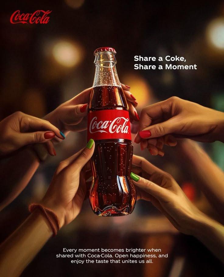
- Coca-Cola
- Apple
- McDonald’s
- Target
None of their logos explain what they sell.
- The swoosh doesn’t show shoes
- The apple isn’t a computer
- The arches don’t show food
- The bullseye doesn’t show products
Yet they’re instantly recognizable. That’s not accidental, it’s strategic.
Principle #1: Recognition Over Explanation
People don’t analyze logos. They glance at them. And in that moment, simplicity wins every time. Big brands didn’t try to educate through their logos. They focused on being distinct, simple, and easy to remember. Because recognition scales. Explanation doesn’t.
| A logo’s job isn’t to explain, it’s to be remembered.
Principle #2: Consistency Creates Meaning
Here’s what most people miss:
Those logos didn’t have meaning in the beginning. They became meaningful through repetition.
- Consistent visuals
- Consistent messaging
- Consistent presence
Over time, people learned what those symbols represent. That’s branding.
Branding is what gives a logo meaning, not the other way around.
Principle #3: Strategy Over Personal Preference
Big brands don’t design based on what the owner likes. They design based on who they’re trying to attract. Different audiences respond to different things:
- A younger audience may prefer bold, minimal, modern visuals
- An older audience may respond better to trust, clarity, and familiarity
If you ignore that, your brand becomes disconnected, no matter how “nice” it looks.
| If your brand is built on your preference instead of your audience, it will miss both.
The Real Breakdown
To understand why big brands succeeded, you need to separate these:
- Logo: your identifier
- Branding: how people perceive and remember you
- Marketing: how you communicate what you do
- Advertising: how you get attention
Most businesses try to force the logo to do all four. That’s where things fall apart.
What This Means for Your Business
If your logo has to explain everything, your strategy is doing too little. The brands that grow aren’t the ones that try to say the most. They’re the ones people remember first. Because in a crowded market, being clear helps, but being memorable wins.
Final Thought
Big brands didn’t succeed because they had better logos. They succeeded because they understood something most businesses overlook:
Your logo is not your message. It’s the symbol people remember after your message works.
Ready to get started?
Ready to discuss your marketing materials, and branding needs?